Thursday, June 21, 2012

DOUBLE the Fun!

I'm very excited to announce my upcoming first feature article in Canadian Scrapbooker magazine!


In the Winter 2012 issue [ yeah, I know .... I shouldn't say the "W" word at this time of year] I will write an article called "Double the Fun" that showcases a 2-page layout sketch I designed.


Here is the sketch....


And here is the sample layout I created for the Canadian Scrapbooker online Submissions web page...
All papers are Glitz Design "Pretty in Pink" collection. Die cuts were cut with my Cricut.

BabyOfTheFamily is a happy crafty girl and is taking a series of cake decorating classes at Michaels.  Yay for her....Boo for my expanding waistline!  {By the way, fondant isn't as yummy as it looks.  Sigh}


Some close ups....
Cricut cupcake, swirls and title.  Fiskars Scallop Border punch.  Sprinkles (aka sequins and beads) from the Dollar Store.

I just love the empowering quotes that are on these Glitz stickers!
One of my new favourite Spellbinders die:  Donna Salazar "Bitty Blossoms."

If you haven't submitted any of your scrapbook pages before, let me tell you, it's super simple and easy.  Just click HERE and you'll find the Call for Submissions, along with my sketch and this same sample layout.  Just take a photo of your layout and follow the upload prompts on the Submissions web page.


It's always fun to see your own layouts in print, so give it a try and submit your double page layouts!


My sweet scrappy friend Michelle (from Newfoundland) designed a wonderful layout using my sketch....click HERE to see it on her blog!  Beautiful work, as always, Michelle!


The deadline is July 15....and remember:  2-page layouts are not Double the Trouble....they are Double the FUN :)

Monday, June 11, 2012

Webster's Pages Say Summer!

When Webster's Pages introduced their new Clean & Simple paper collections, I said YES!  Yes to the same beautiful quality paper and yes to the solid patterns and backsides!  (Having a solid backside myself, I was pretty excited about this design change:)


I thought the  wonderful "Sunday Picnic" line would be perfect for my June Sketchy Challenge for Canadian Scrapbooker.  
Another fantastic sketch by the talented Jill Sarginson!
 
And here is my layout, featuring BabyOfTheFamily....
Sweet Summertime

The journaling strips are on top of a Magenta chipboard sun, which I first painted yellow and then sprinkled clear iridescent Craft & Glitz glitter on top while the paint was still wet. 


For my title, I put the Webster's alphabet stickers on small die cut scalloped circles that I cut with my Cricut.  The large orange scalloped flower layer behind the photo is also cut with my Cricut.  The pink butterfly is a wonderful Martha Stewart Punch layered over a solid butterfly shape I cut in the shape of the punch.  Martha also helped with the the punched scalloped borders.


The orange paper surprised me....I rarely use orange in my designs, but I think it does make this page brighter and happier...just like summer :)


Pop by the newly updated Sketchy Challenge web page over at Canadian Scrapbooker.  

It's now a gallery where you can register, upload your layouts, view and comment on other designs quickly and easily.  And there is always the chance for your layout to be published in a future issue!
 
Even more good news....Sony has an exclusive offer for Canadian Scrapbook magazine readers!  Click HERE and learn more about the S-Frame photo printer that doubles as a digital photo frame.


SONY ROCKS!!!!!!!!!


Tuesday, June 5, 2012

It's That Time of the Month

Half the fun for me in writing my blog is coming up with titles for my posts.  Sometimes I'm boring and just type the obvious, like "Sketch Challenge".....but most often I want my title to be catchy or clever :)


I'm not sure if this post's title falls into the clever category, but it is time to blog about the sketch challenges I participate in at the beginning of every month.


Today I am featuring the layout I designed with the Urban Scrapbook monthly kit....and our sketch challenge was SIX photos.  Yes, SIX.  I think Lynette is looking forward to designing future sketches with fewer photos :)


I thought a multi-photo single layout would work well for a vacation or travel page, so I decided to use photos from our family trip to Europe back in 2007 (when I was still young and beautiful).


My husband convinced (begged) me to travel to Europe with our 3 young children.  Do I regret it?  Was it the trip of a lifetime?  The answer is "no" to both questions.


The trip had its challenges, for sure, like "No, mom, we don't want to see Picasso's famous painting" (while in Madrid).  Guess who sat outside with the kids while DAD went into the Sofia Museum??


Of the 4 weeks we spent in Europe, we were in Spain for 7 days....on the coast and then in Madrid.  The beauty of southern Spain and the coast is breathtaking.  We had a wonderful time.  Honest.


And here's the proof....six snapshots from our week in Spain....
7 Days in Spain


I think the red paper suits Spain, don't you?

In the kit are papers and sticker sheet from the new Echo Park collection "Note to Self", along with buttons, brown burlap ribbon (which I cut into circles and layered under my flower stickers), Tim Holtz metal numbers, Bazzill card stock and a Jillibean Soup chipboard alphabet.


Jan always plans the most wonderful kits and these monthly challenges do push me to scrapbook outside of my "design box."  To see the other amazing layouts the staff designed with this kit, click HERE and visit Urban's blog.


I cannot believe it's time for me to pick up July's new kit from Urban to design with...yikes.  But that means summer is around the corner, and in my house that also means no more making school lunches every morning!  Yahoooooo!

Friday, June 1, 2012

The Simple Stories of My Life

Last week I popped into one of my favourite blogs, Write, Snap, Scrap by Izzyb and found out about a challenge over at Simple Stories.  This got me excited because I had made a 2-page year in review back in January, and I taught it as a class at The Urban Scrapbook.  

 The "elements" papers and matching sticker sheet from this Year-O-Graphy collection was just perfect to document our entire year on one layout.

Here are a couple of close-ups of the left and right page elements...
Butterflies are made with a Martha Stewart punch and card stock

This quote is cut into strips from the Yearography patterned paper


Behind each bingo card month is a pocket that holds a tag for journalling....
I made a different stencil/mask for each tag, which is cut from kraft card stock. Then sprayed with a variety of coloured mists.
I added some SS tiny alpha stickers from the awesome Yearography sticker sheet to highlight certain words in my journaling.
  Here are snapshots of each month...
We celebrated DramaQueen's 15th Birthday
 
In February, BabyOfTheFamily turned 12
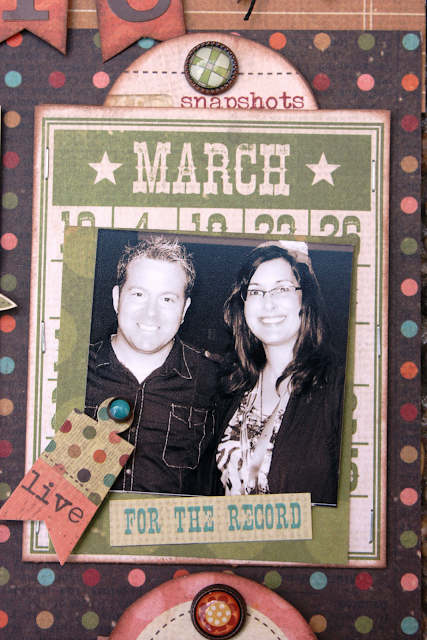
I met Tim Holtz [gasp] at a special scrapbook event and attended his amazing class
Birthday BoyGenius is 17!
May is all about volleyball tournaments

My dark hair turned grey in June when BoyGenius began driving lessons
A happy weekend away in Kelowna with friends in July
Our anniversary...happily married after 22 years

Our Calgary "daughters" come back to school at the University of Alberta

Newfoundland Michelle traveled across the country to see me, and we attended the Canadian Scrapbooker Carnival together
It's legal!  Our nephew celebrates 18 years!
This candy cane sticker is perfect to showcase December's picture of BabyOfTheFamily on Christmas morning
So that's it....our life in 2011...made simple by Simple Stories!