Showing posts with label mask. Show all posts

Sunday, September 2, 2012

Oh....SNAP!

It's the September Sketchy Challenge over at Canadian Scrapbooker, and here is the wonderful new sketch, designed by Sue Sykes...
On Sue's blog, she has an additional challenge going on, so you can post your Sketchy layout there too!  Click HERE to check it out.

 Here is my layout...


BabyOfTheFamily is transforming before my very eyes.  I feel like I need to capture this.  Sniff. [And she got braces this summer!]

Here's a deep dark design secret I'll share today.  I am afraid of graphic patterns.  Very very afraid.  Give me Graphic 45 flying pigs, fairies and vintage ladies and I'm ok.  But chevrons, dots, dashes....I run SCREAMING!

So I thought I'd finally face my fears and use some Studio Calico/American Crafts paper for the next Canadian Scrapbooker Sketchy Challenge.
  
EEEK!  Polka dots, grids, zigs and zags.....

I also decided to add more stamping to my layouts this year [ has not happened til now] and bought these WONDERFUL new Susan K. Weckesser stamp sets from Unity Stamp Company.  
Congrats Susan!!!  Your stamps are fantastic!
I used 4 of these sets on my layout:  A Little Bit Washi, Splatter It,  Insta-Cute, Celebration of Simple


Unity had a huge promotion last month for the release of Susan's stamps, so I went online and had a great time shopping!  When my package arrived, I was delighted to find these 2 bonus stamp sets tucked inside...

Thank you Unity [Angela!]
I used the polaroid frame stamp from "Insta-Cute"

I stamped both photo frames from the set and decided to use only the polaroid shape.
 But for the second frame, I masked off the argyle/chevron pattern across the bottom.  Here's how...
I used scotch tape across, covering the entire pattern.
I put the tape over the side edges of the stamp
Inked it up with Clearsnap Colorbox "Blackbird" Fluid Chalk Ink.  You can see the ink on the tape mask.
Then I pulled off my mask with tweezers [not that I'm afraid of dirty hands, as you well know!]
Stamped onto this Studio Calico "Executive" grid patterned paper [yep, facing my fears!]
Then used my stamp block to draw in those masked edges with my black marker.

  Love the "Smile" and "Say Cheese" stamps too!

I used the same grid paper to stamp washi tape border strips....


The "Splatter It" stamp and green ink helped me create a unique pattern...

Here's a close up look at all 3 stamped layers together...
And the perfect quote stamp also in Susan's set.

These banner stamps are actually quite large, so I cut them almost in half to create my banner.
 I stamped the banners with Clearsnap "French Blue" Fluid chalk ink onto the "Cubicle" patterned paper.

 LOVE these banner stamps....I have all kinds of design ideas in my head for these :)
American Crafts Thickers "Notarized" chipboard alphabet stickers and Maya Road twine.

I stamped the film and camera images onto transparency and cut them out...

To stamp onto transparency, use a solvent ink pad.[Is it just me or does anyone else LOVE the smell of the StazOn ink pad??]
I'm in LOVE with these itty bitty Studio Calico Wood Veneer people.
 I also have a package of Studio Calico wood veneer frames, so I cut one in half to make brackets for another stamp quote...

Some people don't clean their stamps, but I have these awesome products I bought from Stampin Up a long time ago....
This Stampin' Mist smells wonderful too.
A close up of the the scrub mat inside.
Give your stamp a quick spray

Then rub it around on one side to "clean" and then the other side to "dry".
 Every once in awhile, you can pop out these scrub mats from your case and wash them.

Honestly, I didn't know stamping could be so much fun!  And now I'm feeling a little better about grids, dots and chevrons, too :)  In fact I'm feeling REALLY good....maybe it was all the sniffing of StazOn and Stampin' up mist!

Hope to see you and your creations over at the Canadian Scrapbooker Sketchy Challenge Gallery!


Thursday, August 9, 2012

Colourful Cardstock

I find that I rarely use cardstock anymore and seem to gravitate towards patterned paper all the time.  

But our monthly staff challenge kits at The Urban Scrapbook ALWAYS have two or three sheets of cardstock in them (thanks Jan!) which forces me to try to use those solid pieces of paper in creative ways.

I decided to play with some Bazzill cardstock and papers for the August Canadian Scrapbooker Sketchy Challenge.

Here is the sketch by Jill Sarginson...
 And here is my layout...

 Yes, BoyGenius came home with a set of drums and announced he is in a band.  Does he know how to play the drums?  Nope.  But strangely, he does sound pretty good.  That's YouTube video tutorials for ya!

Here's how my mixed media layout came together.  I started out with this cheerful orange Bazzill cardstock...
...then distressed the edges with my favourite Prima Ingvild Bolme distressing tool.
 I decided to rock out and "go for the grunge"  with a stencil and some black gesso...
This is the same Crafter's Workshop stencil I used on my last layout...but this time I stenciled the stars.

There was still lots of black gesso on my stencil so I quickly turned it over and slapped it onto a blank page in my art journal...
HINT:  Use ink and your stencils to give your kids temporary tattoos!
I used Clearsnap Smooch Spritz to create these graffiti splotches and dripping effects (Cherry Ice, Black Velvet and Log Cabin)


Hold your paper upright and spray LOTS at the top of your page, allowing the excess colour to drip down to the bottom edge.
I also sprayed this Bazzill white cardstock circle with red and black Smooch Spritz...
 
Using Ranger's Glue N Seal, I adhered a torn piece of Bazzill Antique sheet music paper to the centre of the stenciled stars.  LOVE the lighter weight of this line of papers.

 To colour the music paper blue, I used Smooch Accent Ink and mixed it with water....a technique I learned from the talented Cathie Allen.
This Smooch colour is called "Azure" (please ignore my dirty stamping block)


First brush some Smooch Ink onto a clear acrylic stamping block.
Then mist with lots of water.

Now rub the colour from your block onto your paper.  I repeated this a few times for better coverage.
I also "Smooched" the Magenta chipboard guitar...
The guitar is coloured with "Wineberry" Smooch Accent Ink.
The title was a complete accident!  I had chipboard letters on a white circle I cut from Bazzill cardstock...and then decided to spray them on the white circle with Black Velvet Smooch Spritz.  I thought I'd throw away the white circle and make another circle for the title.

Well, when I dumped off the coloured chipboard "Rock Star" letters...I found I had used them as a mask and loved the effect!
Here's the original package of Magenta "Rock Star" chipboard, which has other pieces missing from other projects.
The Chili Peppers orange star logos are from the internet and are printed onto white cardstock, along with the journaling strips.
I think the journaling circle looks like a vinyl 45 record (yes, I'm THAT old!).  I wanted to use an actual CD, but thought it was too small.

My son just bought a Chili Peppers t-shirt, and that is where their circular name is from...I took a photo of the image on his black t-shirt, enlarged it on a Word doc and then printed it onto white cardstock.  

I often use smooth Bazzill cardstock to print out journaling with my computer printer.

So now I have a new love affair with cardstock!  Hmmm....you could even call me a "Bazzill Groupie."  

Rock on...and Craft on :)


Sunday, November 6, 2011

Tim Holtz Meets Graphic 45

I suppose I am giving some of you a big SHOCK by designing Christmas cards.

If you're surprised about this, it's because you know I don't make many cards and have even been known to buy the Hallmark variety...Gasp!


I've always admired cardmakers who create spectacular pieces on such a small canvas.  So, when I was invited to teach a card class at Urban Scrapbook,  I thought, "Heck, yes! I'm going to give it a whirl!"

Using the new Graphic 45 Christmas Emporium collection and the Tim Holtz Mini Paper Rosette Sizzix die, I designed 5 cards and thought I'd share a few of the details with you.
The Graphic 45 Christmas Emporium paper pack...beautiful vintage papers!
 Here is the first card....
On Santa's Knee
The background is inked and embossed kraft paper, plus I used real Wood Veneer paper (Thin) from Creative Imaginations to design the mantle.
I used Fired Brick Distress Ink and the Prima Brick mask/stencil to alter the piece of kraft paper.
Then I embossed the "brick wall" with a Tim Holtz "Gridlock" embossing folder to create more texture...
After embossing, I lightly inked the raised design with Vintage Photo Distress Ink.
I also embossed the top of the wall with a Tim Holtz Wood Grain embossing folder...
...and inked the raised design again with Vintage Photo.
Close up of Wood Grain wall and wreath
The wreath is made with two medium rosette flower strips attached together.  I found it helpful to create a stable base for this wreath to sit on, so I made a "donut" out of scrap paper....
Here is the Paper rosette die I used on each card
The red ribbon is actually plain cream rayon ribbon (seam binding) coloured with Fired Brick Distress Stain.  Crumple it while still wet with the Stain and let dry in a crumpled ball to obtain the worn out vintage look.
Distress Stains come in so many different colours and allow you to transform any piece of seam binding!
The second card is called "JOY"...
I used 3 Tim Holtz dies to create this card....
I was a little sneaky with the "upon a time" alphabet and actually used the "Y" as the letter "J" because I didn't like the shape of the J in the original alpha.  Just cut off the arm of the Y and you have a J!! I should have been a rocket scientist...or a brain surgeon :)

The third card is named "Wishful Window" ....
The mother with children looking into a store window is an image from a piece of the Graphic 45 paper, which I fussy cut.  Then I framed the window with real Wood Veneer paper, inked with Walnut Stain Distress Ink.  The small mini rosette is accordion folded and adhered as an awning across the top of the window.
Off-white cardstock becomes swirly snow with a Tim Holtz "Swirls" embossing folder.
 The snow banks are cut and layered below the window. Then I added clear Stickles to the raised design to add some sparkle...
 This time I coloured the plain ribbon with Stormy Sky Distress Ink. 
To do this, you press the ink pad randomly on the ribbon (I didn't want solid coverage, so I missed some spots), put it in a plastic sandwich baggie, mist with water, then crumple and let dry.
Voila!  A lovely vintage blue ribbon is born!

The fourth card is "Christmas Carols"...

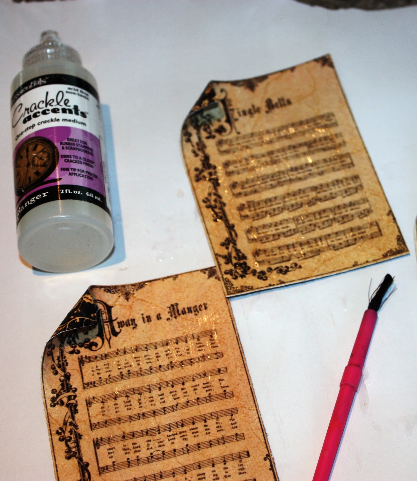
To age the carol music paper pieces, I used Crackle Accents and Walnut Stain Distress Ink.
With a paint brush, add a medium thick coat of Crackle Accents and let dry completely, about an hour or more.
When the Crackle is dry, ink the whole surface with Walnut Stain, mist with water and wipe off with a tissue or paper towel. The dark ink stays in the cracks, making them more visible.  Now you have beautiful vintage music paper!

The die cut elements are from the new Tim Holtz Festive Greenery Sizzix die.....
I cut the pieces from off-white Bazzill cardstock
....and then transformed them with a variety of Distress Inks....magical!
All the inked pieces and a small paper rosette are adhered to a piece of black cardstock and sprayed with Perfect Pearls "Heirloom Gold".
I love this Festive Greenery die...so pretty and versatile!
The fifth and final card is titled "O Jolly Christmas Tree"...
I wish my kids looked like this on Christmas day :)
The Christmas tree is made with 2 medium rosette strips, separated into pieces...
TIP:  Ink all the pieces before you assemble and layer into a tree.
Sookwang tape is the best adhesive to adhere the tree layers together.
Stack up your layers and adhere along the accordion folds.
Adhere the sides of the tree rosette pieces so they lie flat and you get a tree shape.
Also, I cut a 4" x 2" triangle shape to use as a base for the tree...adhering the rosette tree to a base will stabilize it and help it keep a nice shape. Oh, and the tree trunk is a little strip of real Wood Veneer paper inked with Walnut Stain.
Side angle of flattened sides of tree.

Fabri-Tac liquid adhesive by Beacon Adhesives is wonderful for this because it dries VERY quickly.

I also use Fabri-Tac as the adhesive for all the rosettes.  Some people prefer a hot glue gun, but I'm not a big fan of burning off my fingerprints :)

Hope this inspires you to make some Christmas cards....or at least start your shopping :)

GIVEAWAY!!!!!!!!!!!!
And my early Christmas present to you....if you comment on this post and are a "Follower" of my blog, you will be entered to win a kit to make ALL these cards!! I'd also love to hear which card is your favourite :)  Thanks for visiting!